
THE DESIGN CHALLENGE

ROLE
UX Designer — self-initiated project
CONTEXT
Loto-Québec · Espacejeux (concept)
TIMELINE
2025
METHODS
Journey Mapping · Research Synthesis · Behavioral Design · Prototyping
This project started outside the office. Playing occasional group lottery pools with friends, I watched how quickly the experience deflated at purchase: everyone had numbers that meant something to them, yet the interface gave those numbers nowhere to live, and most defaulted to the random pick within seconds. The moment of buying a ticket felt like it could be so much more than a transaction.
I was interning on the web analytics team at Loto-Québec, the state-owned corporation operating Québec’s only legal online gaming platform (espacejeux.com), when a benchmark study by Léger, a leading Canadian market research firm, gave that intuition evidence. Comparing the platform’s digital experience to competitors, the study flagged two priority gaps: Inspiration & Guidance (users don’t feel oriented or advised) and Personalization (nothing in the experience adapts to them). Exactly where my observation pointed. So I took the initiative to redesign the lottery number selection process, the point where these two gaps most directly intersected. I successfully turned a fast, mechanical checkout step into an interactive 'number creation workshop' that introduced saved favorite numbers, hot/cold statistics, and a hybrid generator for smart completion.
The core problem is the experience itself. Buying a draw ticket online takes seconds and involves almost no meaningful interaction, so the moment is neither engaging nor memorable, and it gives players little reason to come back, especially when the odds mean they almost never win. My working hypothesis went one level deeper: players would rather choose their own numbers than trust the random Quick Pick, but composing a 7-number ticket from a grid of 50 is cognitively demanding, so they fall back on random generation anyway, and a random ticket is one they feel no attachment to.
Espacejeux.com is Québec's only legal online gaming platform, operated by Loto-Québec, a state corporation with a responsible-gaming mandate. Its current number selection page is a bare grid and a random pick button: functional, fast, and flat.
Three things confirmed the problem:
Most players still buy their tickets at retail, and part of the reason is that the physical experience is simply richer: making the trip, picking numbers on a paper slip, holding the ticket in hand. That tangibility creates a sense of participation the online flow never attempts to recreate.
The appetite for number data was proven. The platform once had a statistics page that, as a colleague on the team recalled, was very popular before being retired.
Competitors were already filling the guidance gap. The Léger study noted that Bet99, for example, stands out with a dedicated Guide page that introduces the platform and accompanies users through it.
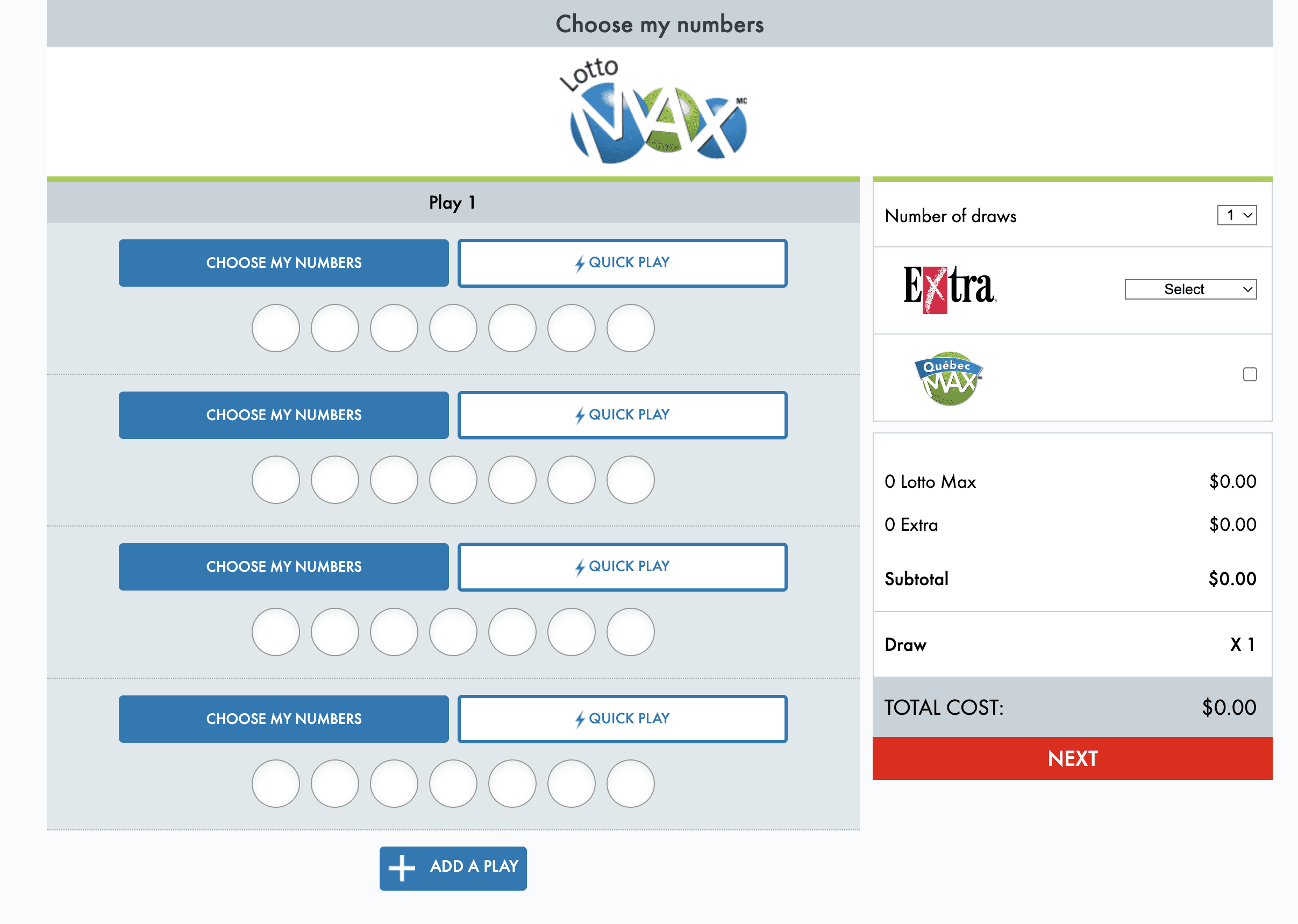
Fig. 01 — The current number selection interface on Espacejeux
To locate exactly where the experience falls flat, I mapped the emotional arc of the full purchase journey across its four stages:
Site Visit: the player arrives with the intention to buy. Emotionally neutral, a routine action.
Number Selection & Purchase: the player picks numbers manually or generates them randomly, then pays. Neutral to mechanical: fast, functional, no engagement.
Waiting for the Draw: anticipation builds. This is the only genuinely positive stage: excitement, hope, dreaming.
Discovering the Results: given lottery odds, this almost always ends in disappointment or resignation.
One single step in the entire journey produces positive emotion, and it’s the one the platform doesn’t control — the wait. The purchase itself, the moment the interface fully owns, is emotionally flat. That flatness was the opportunity: enriching number selection could add a second emotional peak to the journey, exactly where the Léger dimensions applied most naturally.

Fig. 02 — Emotional arc of the purchase journey across its four stages
This project followed a thread, not a formal research plan. An observation from real life became a hypothesis, the Léger study gave that hypothesis evidence, and the emotional journey map pinpointed where to intervene. From there, the solution took shape through a mix of behavioral principles, experimentation, and creative exploration.
My journey analysis contributed one principle, and the Léger study contributed two:
Interactivity
Journey analysis
The selection step had to become longer and richer, giving players something to explore and play with, so the purchase itself could carry emotion instead of being over in seconds.
Personalization
Léger study
The experience had to be built around the player’s own numbers — the dates, memories, and lucky digits that already matter to them.
Inspiration & Guidance
Léger study
Statistics and advice had to live inside the selection flow, where the decision happens, not on a separate page.
Two psychological principles shaped the concept:
The IKEA effect: people value what they build themselves, so my hypothesis was that self-composed numbers carry more attachment than random ones, even after a loss. Satisfaction comes from participating, not only from winning.
Choice overload: the counterweight, since picking 7 numbers from a grid of 50 is paralyzing enough to push players straight back to the random pick. The resolution between the two became the core mechanic: the player chooses the 2 or 3 numbers that matter to them, and the system intelligently completes the rest.
I explored widely before converging, from astrology-based picks and fun facts to pattern analysis and common pitfalls (like birthday dates leaving every number above 31 untouched), keeping only the ideas that served ownership and honest guidance, and dropping anything that risked implying better odds.
Two analogies anchored the concept:
Number creation workshop: The experience itself should feel like a workshop: a place where you craft your numbers rather than just pick them, and that is where the interactivity lives.
Horse Race: And playing your numbers should feel like betting on your favorite horse, maybe even your own horse. It didn't win today, but it's yours, you believe in it, and you'll be back to bet on it next time. Not better odds, just a bond. More than a ticket, an experience.
Five modules make up the redesigned page, built as an interactive Figma prototype that follows the natural sequence of the purchase:
Your Numbers → Analysis → Selection → Tips.
The page serves both player types: a casual player can still one-tap the classic Quick Pick and check out in seconds, while an invested player can go as deep as they want, with each layer available but never mandatory.
The whole experience begins with personalization. Players save and organize favorite numbers in custom groups such as "Lucky numbers" (star icon, yellow), "Family dates" (heart, red), and "Personal favorites" (blue), and can create new groups freely. Saving them once means players don't have to remember or retype them, and they become the building blocks for the Personalized Quick Pick later in the flow.

Fig. 03 — Personal number groups: saved favorites become building blocks
The current site buries winning-number history in a plain text list on a separate page.

I moved the data directly into the selection flow and made it interactive, split across three tabs:
Frequency chart: how often each of the 50 numbers came up in the last 100 draws, color-coded red to blue so trends read at a glance.
Hot Numbers: the most-drawn numbers with their counts.
Cold Numbers: the same, for the least-drawn.

Fig. 04 — Number Analysis: frequency chart with Hot and Cold tabs
Past draws shown as clear cards, each with the date, winning numbers, jackpot, and number of winners. The most recent draw is highlighted, and a small line ties the results back to the player: "You had 3 numbers in common with this draw."

Fig. 05 — Recent draws as cards, tied back to the player’s numbers

The core of the prototype, where everything above comes together. Next to Manual and the classic Quick Pick, this third mode opens a small workshop. Inside, the player builds a ticket from two sources:
Their saved personal numbers, organized by group.
The hot or cold statistics.
Four playful strategies (Balanced, Trend, Contrarian, Personal) accompany the choice as inspiration, not tips on how to win.
A counter tracks progress toward the 7 numbers and shows the split between personal and statistical picks. Whatever the player doesn’t choose is filled in randomly.
This is the choice-overload solution in action: the player picks what matters and lets the system handle the rest. And since a saved pool can hold more than 7 numbers, the same set can produce many different tickets, each one still personal, which gives players a reason to come back and try new combinations.
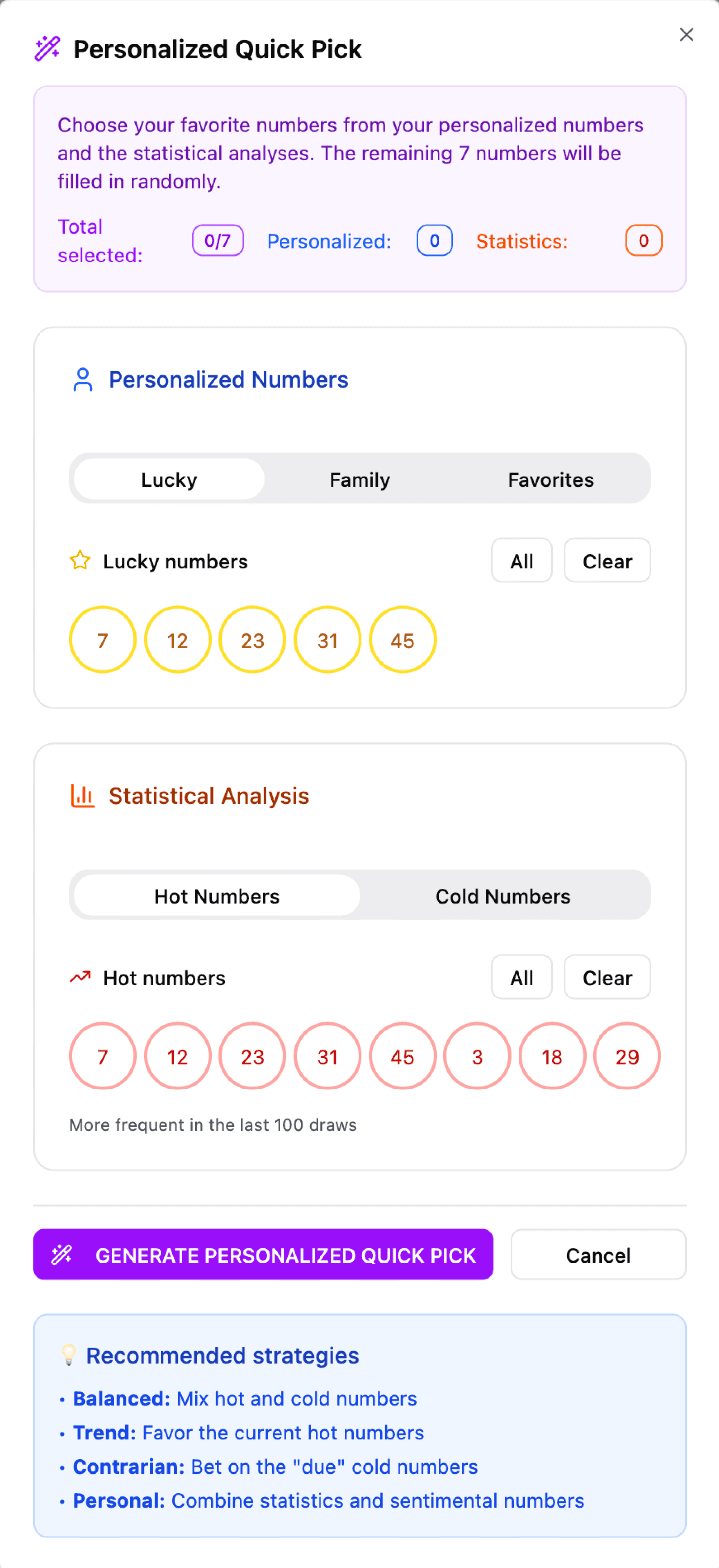
Fig. 06 — Personalized Quick Pick: personal numbers plus statistics, completed automatically
This section answers the Inspiration & Guidance gap. Six playful strategies were introduced, covering different angles of the game: balance, statistics, personal dates, group play, sequences, and budget. They are not tips on how to win; they exist to inspire the choice and make it more fun.
The table presents them with two safeguards:
A "What it really does" column gives a plain-language reality check for each strategy. For example, balancing odd and even numbers changes nothing, it's just fun, while playing small regularly is the one that actually helps, because it protects your budget.
A reminder banner closes the section, stating that no strategy can guarantee a win and inviting players to play within their means.
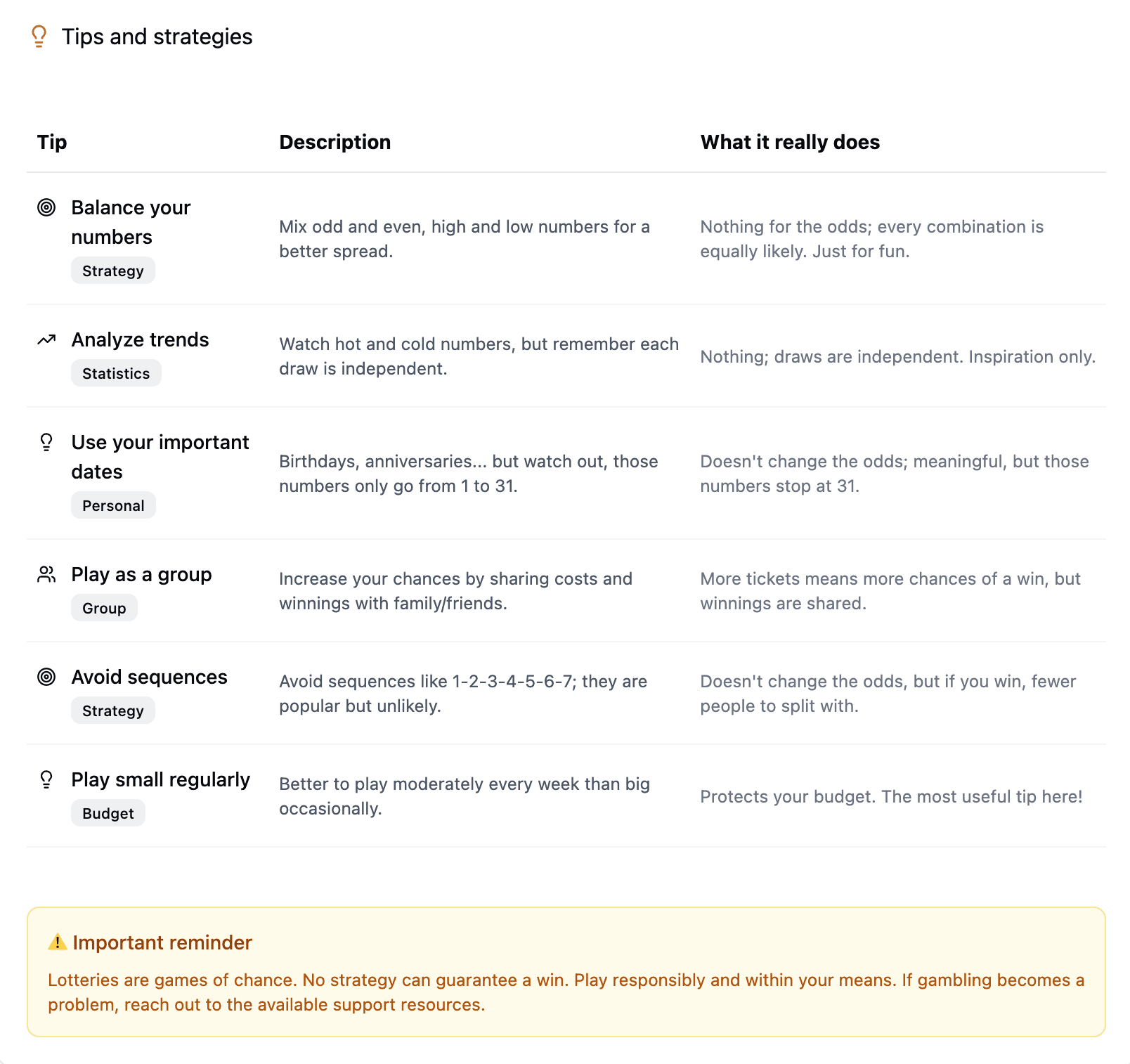
Fig. 07 — Six strategies with a “What it really does” reality check
Emotional journey mapping finds opportunities a feature audit never would. Nothing in the flow was broken; it was flat, and flatness doesn't show up in dashboards or bug reports. Mapping the player's emotions is what revealed that the whole experience hinged on a single positive moment the platform didn't even control.
The right questions often come from outside formal research. This project started by watching friends play, long before any study crossed my desk. Informal observation isn't evidence, but it's often where hypotheses are born.
A responsible intent still needs to be proven. I designed this to enrich the experience, not to push players to buy more, and I kept responsible-gaming values in mind throughout. But good intentions aren't a guarantee, and real questions about its ethics remain. That's why this project's real test is still ahead, and it would need primary research with users on two fronts:
Interactivity: does the workshop actually make the experience more interactive, and does it meaningfully change the user journey, or does it just add steps?
Ethics: do players clearly understand that the statistics and tips are there for inspiration only, and not as a way to improve their odds?
TRY IT YOURSELF
The interactive Figma prototype is public, click through all five modules yourself. Opens in a new tab.
Open the prototype