
THE DESIGN CHALLENGE
ROLE
UX Researcher & Designer
CLIENT
CHU Sainte-Justine
TIMELINE
Sept 2024 – May 2025
METHODS
Observation · Interviews · Survey · Prototyping · Usability Testing
01 — Overview
CHU Sainte-Justine, one of Canada’s largest pediatric hospitals, developed a new, simplified method for diagnosing hemostasis disorders. The complex bleeding-time procedure was traditionally performed by specialized lab technicians, the new method hands it to nurses, who have never performed blood analysis before.
I designed the mobile app that supports nurses through the process: step-by-step guidance, timed blood collection, photo capture for AI-powered analysis, and access to patient reports.
01.1 — User Needs
Nurses need a simple, reliable way to perform the hemostasis diagnostic end-to-end: guidance through the protocol, capture of the blood filter paper for analysis, and access to the patient’s report.
The real constraint is the environment. Nurses perform this at a patient’s bedside, often with one hand free, under time pressure, with no margin for error. The app has to work within that reality, not around it.
02 — Process
The project unfolded in two phases.
Phase 1 studied the full diagnostic procedure to understand how the new method would fit into the real clinical workflow. Observation and interviews, synthesized into an experience map, revealed exactly where the mobile app was needed.
Phase 2 focused on designing the app for its new primary user, the nurse, moving from a survey through prototyping to usability testing.
02.1 — Observation
I observed 3 live bleeding-time protocols at CHU Sainte-Justine, watching nurses perform the procedure end-to-end: room preparation, patient intake, incision, timed blood collection on filter paper every 30 seconds, sample photography, and data upload.
This revealed the core design constraint: the nurse is simultaneously managing a patient, a timer, and a delicate sample, often one-handed. And the procedure itself is new to them, a complex, time-sensitive task taken on without years of specialized training.


Fig. 01 — Live bleeding-time protocol observations at CHU Sainte-Justine
02.2 — Interviews & Experience Map
I followed the observations with semi-structured interviews with nurses, then analyzed the data using inductive affinity mapping in Miro to surface recurring themes.
From this synthesis, I built an experience map of the nurse’s journey, essentially a task analysis of the procedure. I broke the workflow into 5 steps, each with its own sub-steps, and tracked the nurses’ emotional state across all of them:

Fig. 02 — Experience map: five steps of the procedure and the emotional curve across them
The emotional curve is clear: nurses feel confident at the familiar start (Step 01) and finish (Step 05). The friction happens in the middle with the two completely new steps.
Step 03 (Blood Collection) is the most stressful step of the procedure. It’s the core of the new method: a precise, timed sequence the nurse has never performed before. Their main fear is forgetting a sub-step or making an error mid-procedure, with a patient in front of them and no expert to fall back on. This became the case for the app’s step-by-step Guidance feature.
Step 04 (Data Entry) carries a different uncertainty: capturing a clean, usable photo of the blood filter for analysis. This maps directly to the app’s Image Analysis feature.
The experience map defined precisely which steps the app needed to support and why. Phase 2 focused on designing those two flows for nurses.
02.3 — Survey
After the qualitative phase, I ran a 17-question survey with a wider group of nurses to test whether the patterns from observation and interviews held at a larger scale.
The survey lined up with the qualitative findings. Most nurses had no experience with filter-paper blood collection, reinforcing the need for full step-by-step guidance. Responses showed a clear split in tech comfort, meaning the interface had to serve both first-time and experienced app users. Nurses preferred visual instructions over text, and pointed to photo capture as their main concern: image quality, limited phone access during procedures, and no real-time feedback.
With the direction confirmed across methods, I set three design principles: visual-first guidance, minimal-interaction flows, and assisted photo capture.

Fig. 03 — Survey hypotheses, confirmations, and design responses
02.4 — Prototype
I mapped user flows in Miro and built a 23-screen interactive prototype in Figma, using Material Design 3.
The app follows the natural sequence of the procedure: Guidance → Image Capture → Report and supported two flows from the start:
First-time nurses follow the full guide, which continues directly into Image Analysis.
Experienced nurses skip the guide and upload the photo directly, with the stopwatch available as a standalone tool on the main screen.

Fig. 04 — 23-screen prototype flows in Figma (Material Design 3)
02.5 — Usability Testing
I tested the prototype remotely with nurses across 3 task scenarios, collecting ASQ satisfaction scores after each task. Every issue that surfaced led to a specific design change:
PROBLEM
DESIGN RESPONSE
No orientation before the guided flow.
None of the participants knew what to expect after launching the guide: how many steps were ahead, which instruments to prepare, or that a stopwatch would start at a critical point.
Two entry points before the procedure. A “How It Works” button covers the app, the steps ahead, and the materials to prepare. The materials are also broken out into a separate checklist, so the nurse can verify her setup in seconds without rereading the guide.
Patient information collected at the wrong point.
The flow asked for patient details on the photo analysis screen, which felt disjointed and late.
Moved patient details to the start, before the guide. The nurse enters them once, works through the steps, and the final step takes her straight to photo analysis with everything already filled. If she skips the guide, she’s prompted there instead.
Bleeding time required manual transcription.
Nurses had to read the time off the stopwatch, note it down, and re-enter it on the photo analysis screen.
Automated the handoff. The stopwatch saves the time and carries it forward, with a line confirming it’s saved and doesn’t need writing down.
The stopwatch was passive.
Nothing prompted the nurse when to collect, leaving her to track the 30-second intervals herself during the most demanding part of the procedure.
Made it active. The stopwatch turns red and prompts her each time a sample needs to be collected on the filter.
Confusing photo options on a cluttered screen.
The two buttons for “Upload” and “Photo Assistant” were indistinguishable and crowded with instructions.
Renamed the buttons and moved the capture guidance on a dedicated screen.
No patient identity on the Image Analysis screen.
With details entered at the start, nothing on the screen showed whose sample it was, leaving nurses unsure the information had been saved.
Displayed the active patient’s name, with confirmation that the details are saved.
Report search was too restrictive.
Nurses couldn’t search by record number, and many assumed every field (name, surname, date of birth) had to be filled to find a report.
Added search by record number and enabled lookup by any single identifier, so one field is enough.
03 — Solution
03.1 — Preparation
Before the patient arrives, the app supports the setup phase through two entry points, the right one depending on the user’s familiarity with the workflow.
“How It Works” is a lightweight orientation guide for first-time users. It walks the nurse through what the procedure involves, the steps ahead, how the stopwatch behaves, and the materials to prepare.

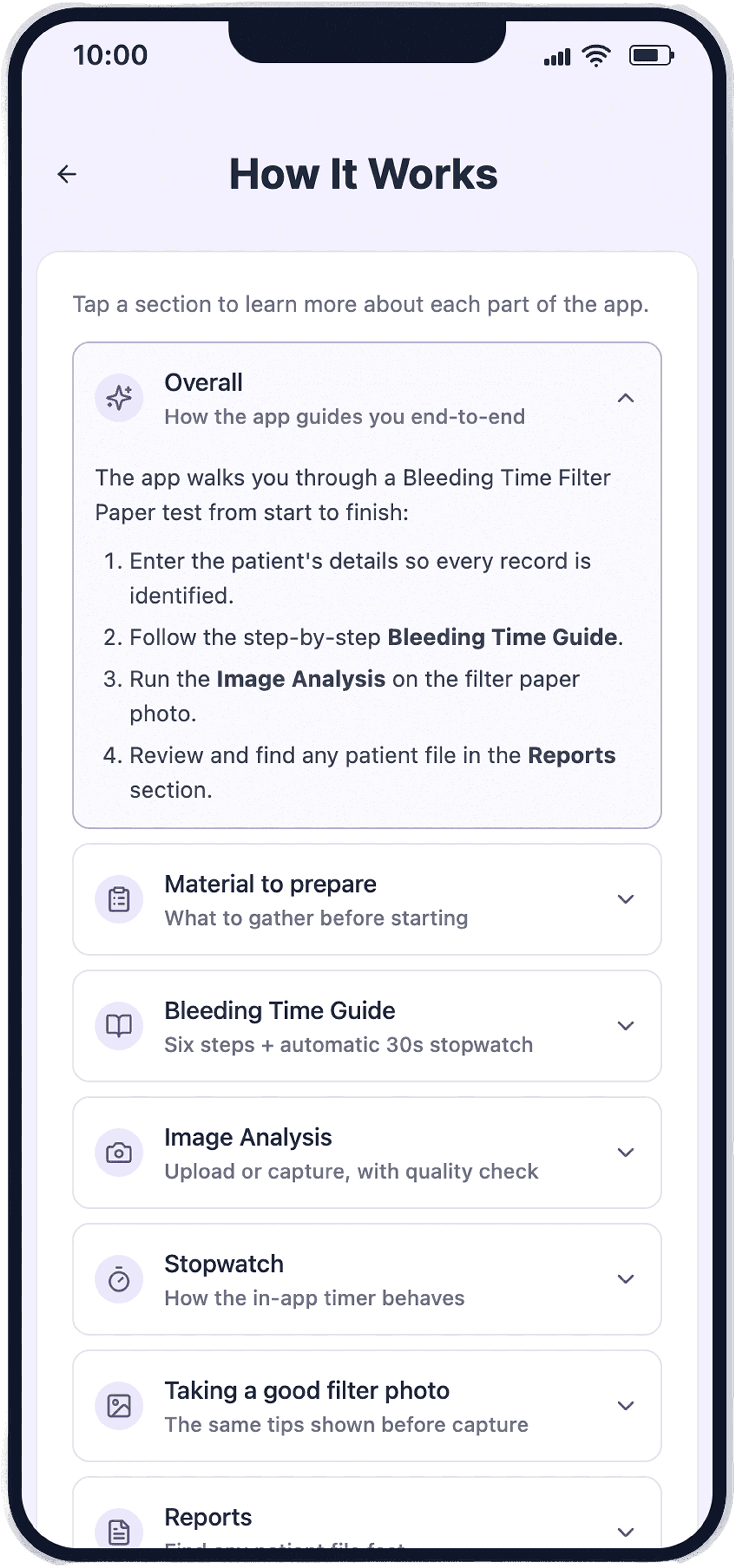
Fig. 05 — “How It Works” orientation screens
The materials are also broken out into a standalone checklist. Unlike the orientation guide, this is a recurring tool: the nurse can open it on every procedure to verify the setup in seconds.

Fig. 06 — Standalone materials checklist
03.2 — Guidance
Addressing Step 03 from the experience map, the most stressful step, the app provides a full step-by-step protocol with illustrated instructions and timing support. The visual-first design came straight from the survey: nurses overwhelmingly prefer images over text when learning new procedures.
The flow is connected end-to-end. The nurse enters patient details once at the start, follows the steps in sequence, and finishes with the timed blood collection. The guide then leads directly into Image Analysis, with the patient details and recorded time already filled in.


Fig. 07 — Step-by-step Guidance screens
03.3 — Stopwatch
The timed blood collection is the heart of the procedure, and the stopwatch is what carries the nurse through it, guiding the timing so they can stay focused on the patient and the sample rather than the clock.
Because nurses worried about losing track of the 30-second intervals, the stopwatch turns red and prompts them each time a sample needs to be collected. And to spare them from noting the time by hand, the elapsed time saves automatically and carries into Image Analysis, it never has to be written down or re-entered.
The stopwatch is also available as a standalone tool, so experienced nurses can skip the guide entirely and go straight to timing.

Fig. 08 — Stopwatch with collection prompts every 30 seconds
03.4 — Image Analysis
Addressing Step 04, the app offers two clearly labeled paths: Take Photo or Upload.
Framing guidance appears in context while they shoot rather than being announced as a separate “assistant,” and the detailed capture instructions live on a dedicated screen that opens the moment they choose to take a photo, keeping the main screen uncluttered.
The active patient’s name stays visible throughout, and the patient details and bleeding time captured earlier are already filled in, so nothing has to be re-entered.


Fig. 09 — Image Analysis: Take Photo and Upload paths
03.5 — Patient Reports
The Reports screen gives nurses and clinical staff immediate access to each patient’s diagnostic outcome. Color-coded status indicators, with normal in green and abnormal in red, are visible at the list level, enabling quick triage without opening individual reports. A record can be found by any single identifier: record number, name, or date of birth.

Fig. 10 — Patient Reports with color-coded status indicators
03.6 — Outcomes
The result is one continuous flow where patient details are entered once, timing is captured automatically, and photo capture is guided in context. The entire experience is designed to be trusted by someone performing the procedure for the first time.
04 — Reflections
This project taught me how much the physical context of use shapes design in healthcare. Choices that might pass in a consumer app, like a clever button label or a stopwatch that leaves the nurse to write the time down herself, created real friction for someone holding a blood sample in one hand and a phone in the other.
It also taught me the value of broad research before narrowing focus. Mapping the nurse’s full journey is what let me scope the app precisely to the two steps where support mattered most, Steps 03 and 04, instead of designing for the whole workflow and diluting the effort. Without that map, I would have started designing too early and solved the wrong problem.
If I were to continue, I would run a longitudinal study with nurses using the app during real procedures, to validate whether the guided flow holds up under clinical pressure, and whether returning users adopt the standalone stopwatch shortcut as intended.